BRAND DESIGN
BE SALON & SPA
BE SALON & SPA BYRON BAY
The initial design brief was to develop a sophisticated brand image that captured Byron's relaxed vibe and Tracey's holistic approach to wellbeing.
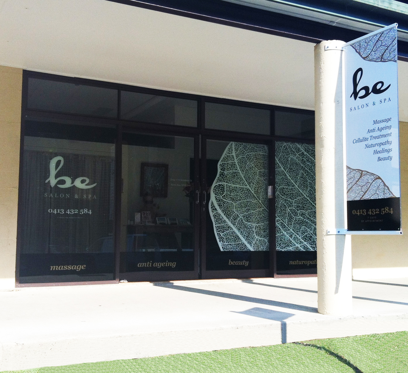
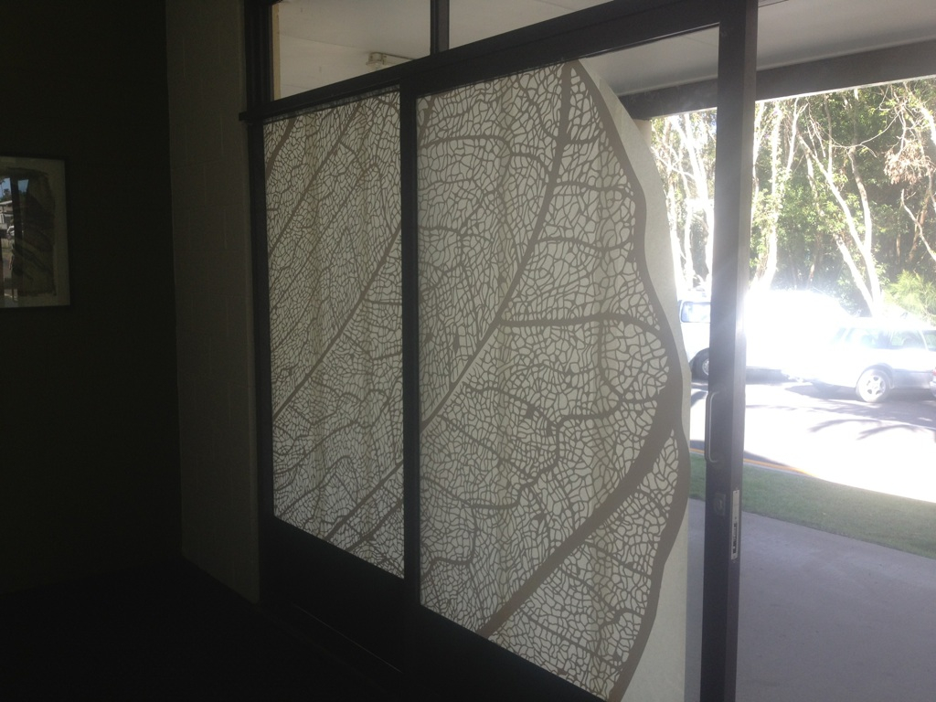
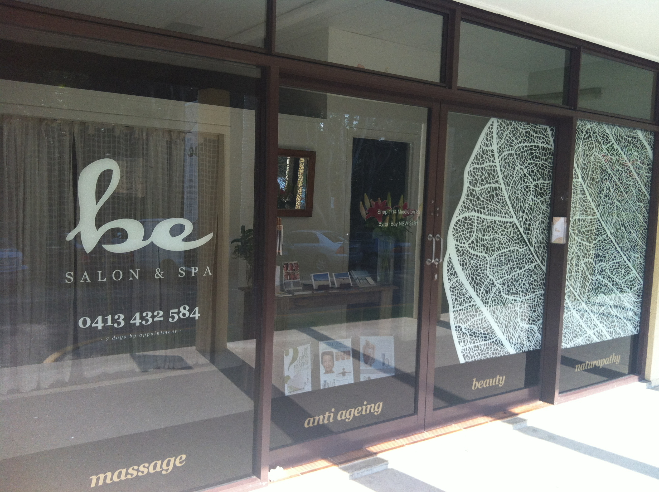
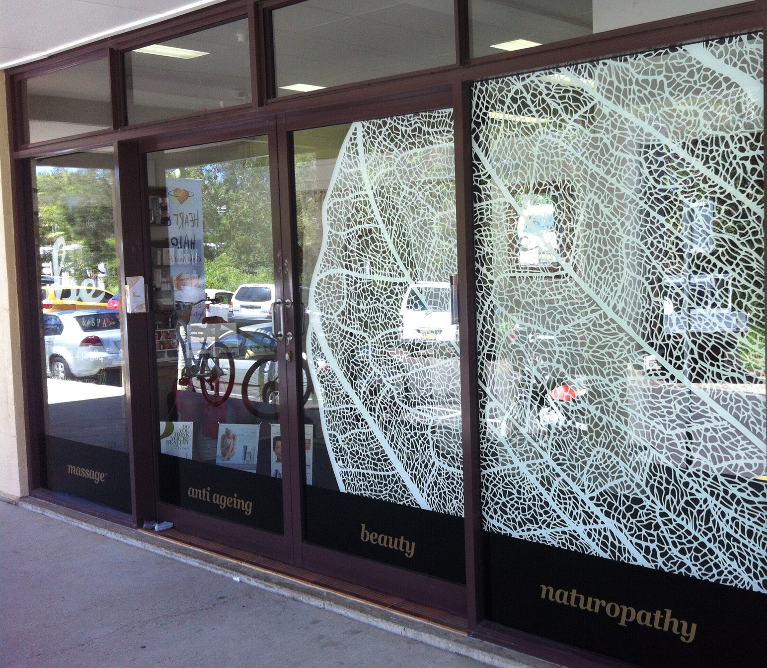
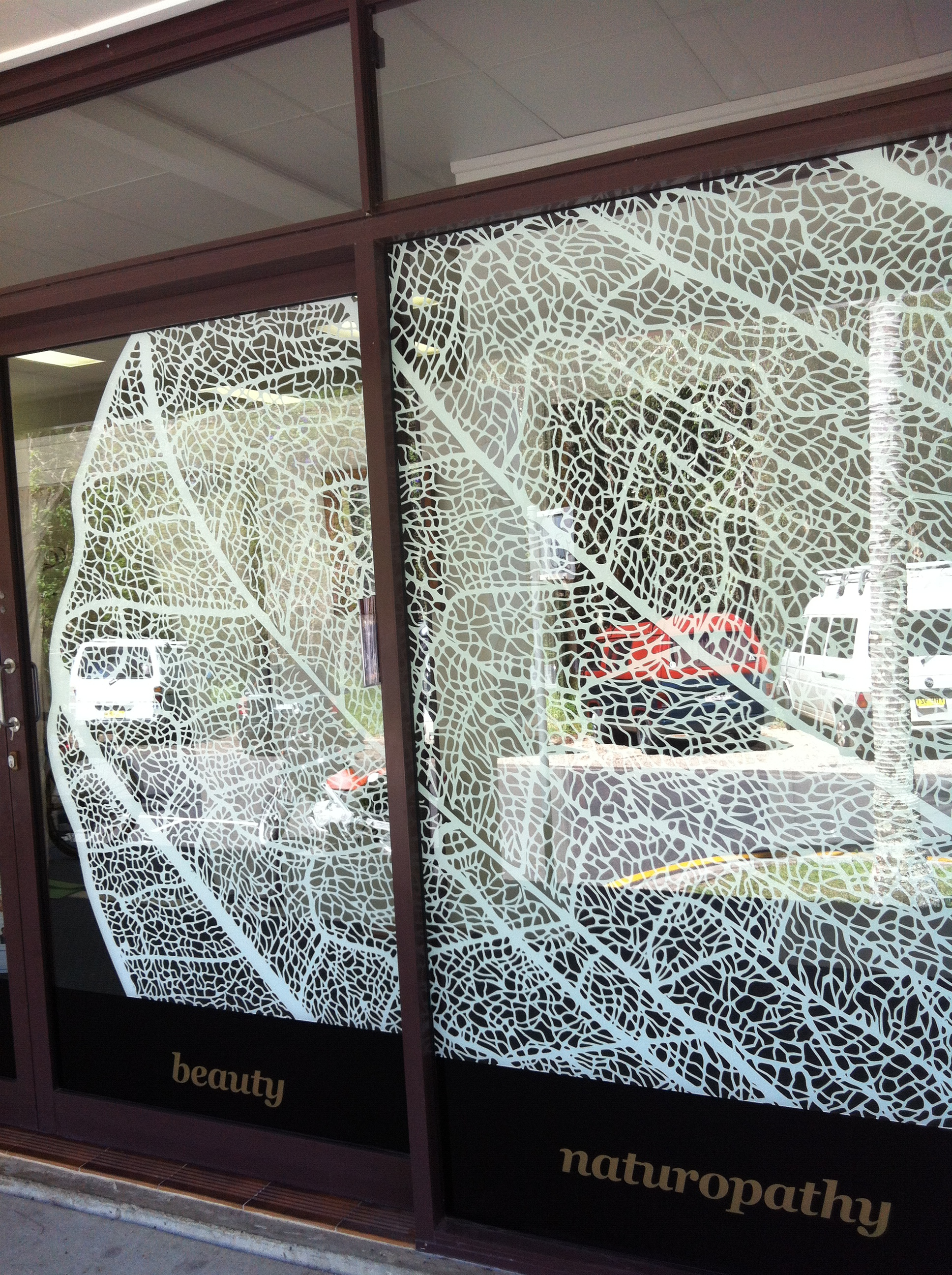
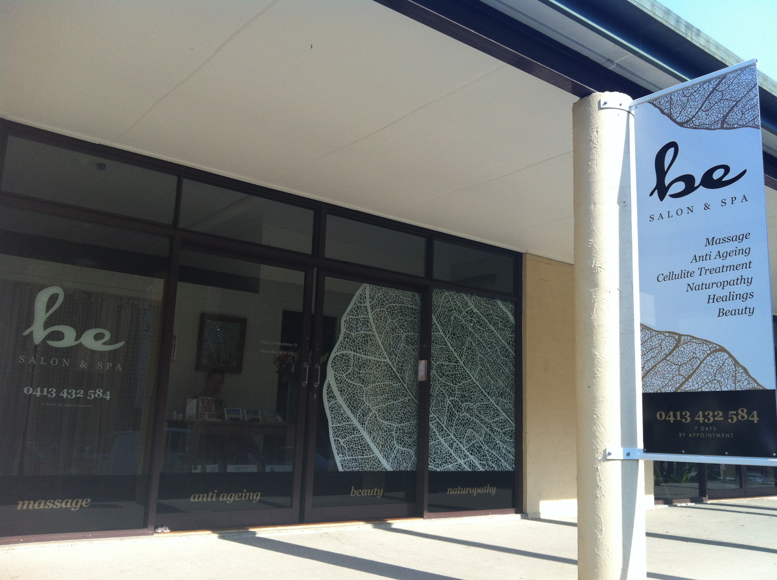
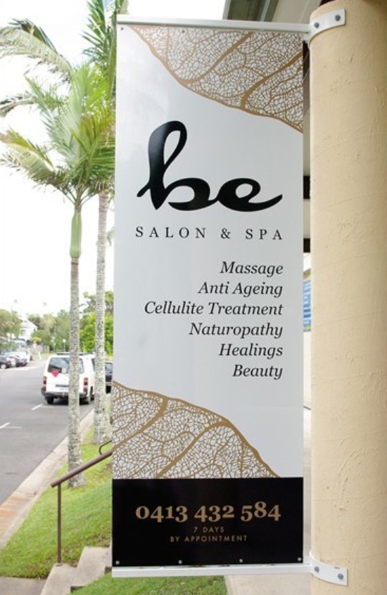
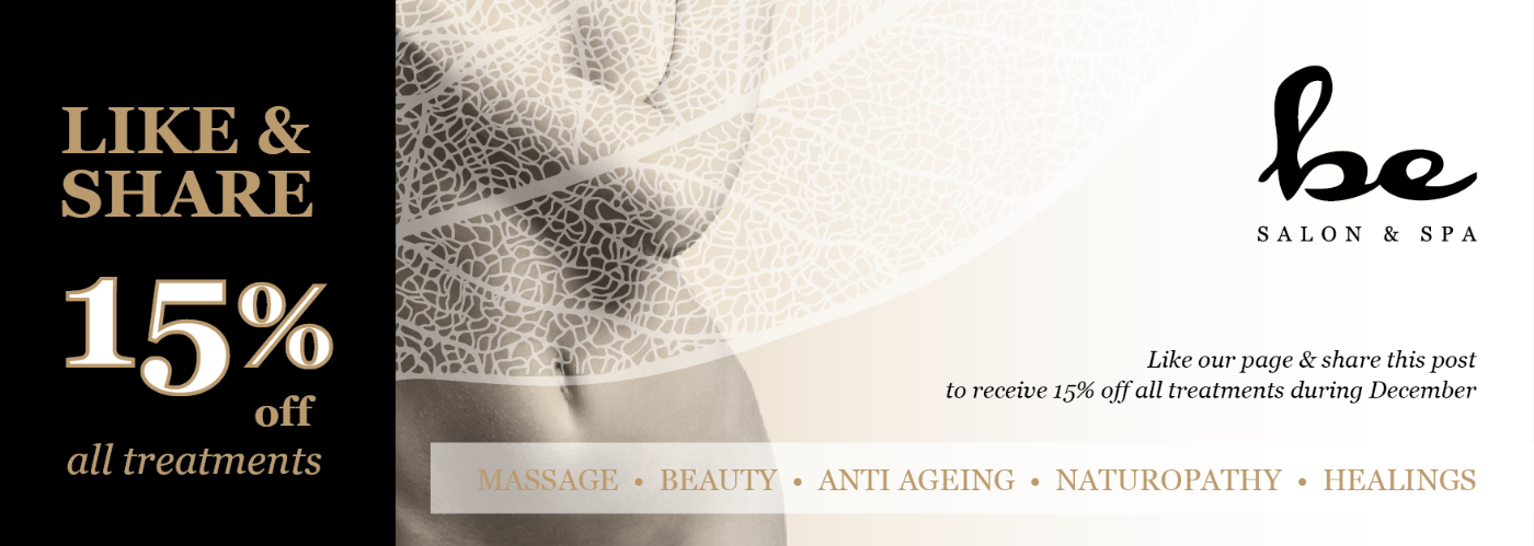
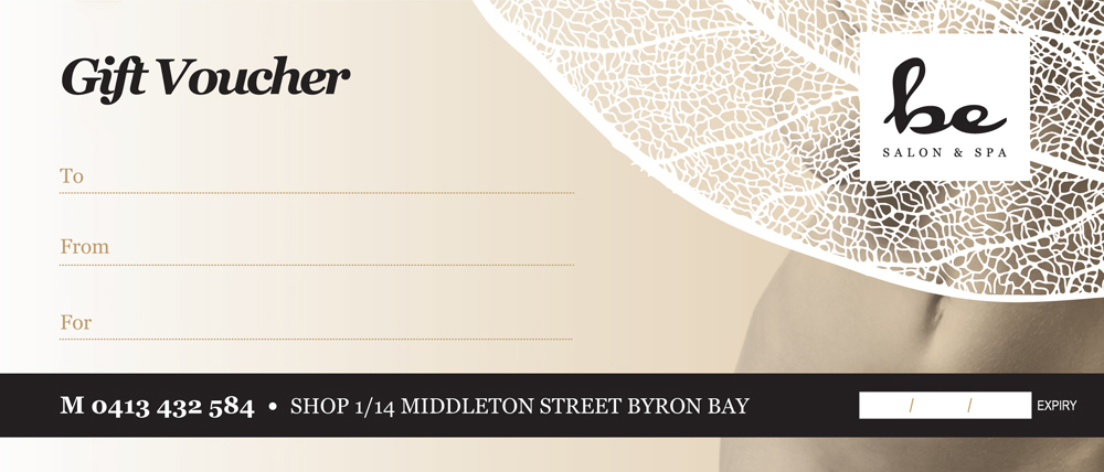
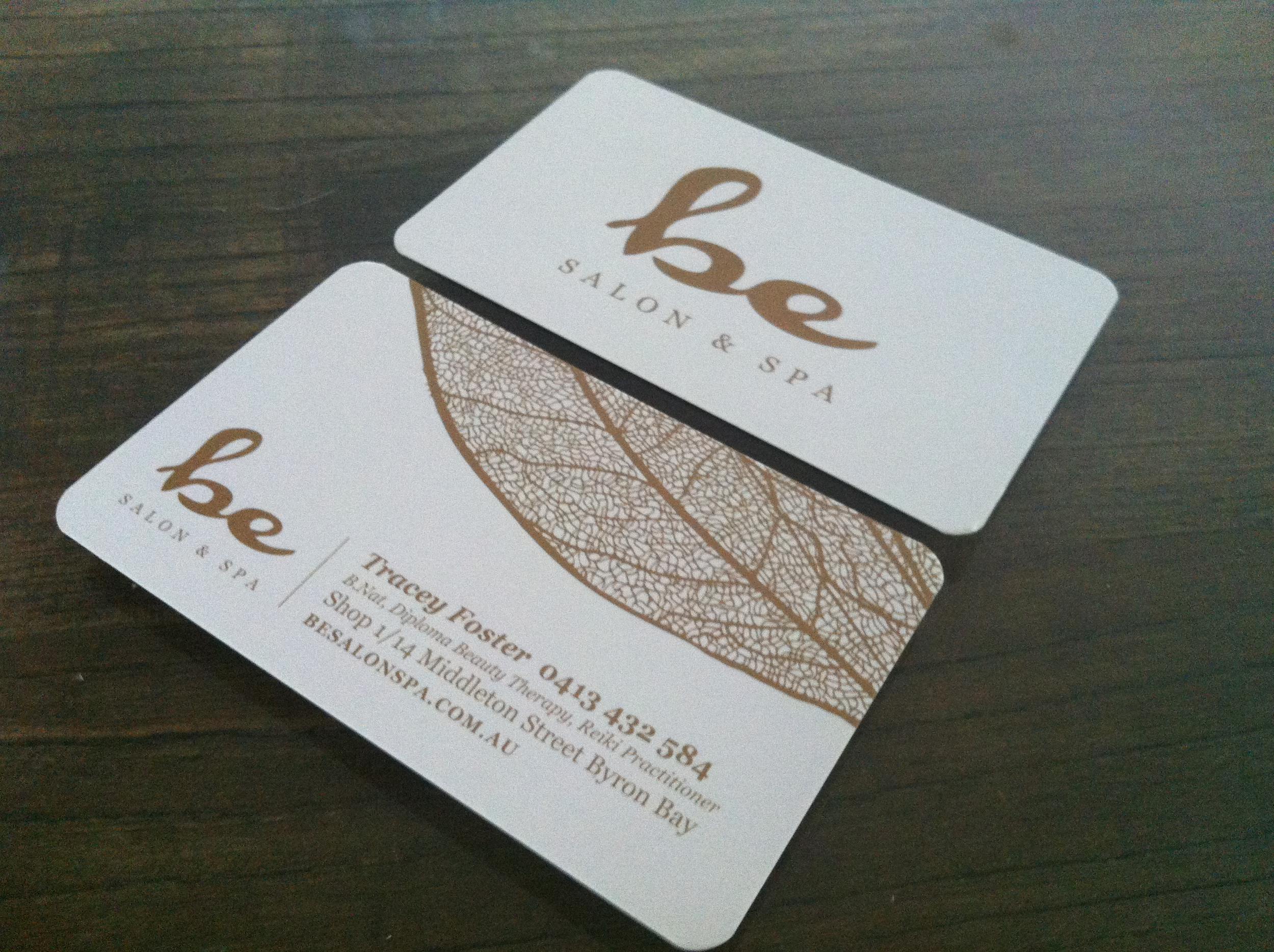
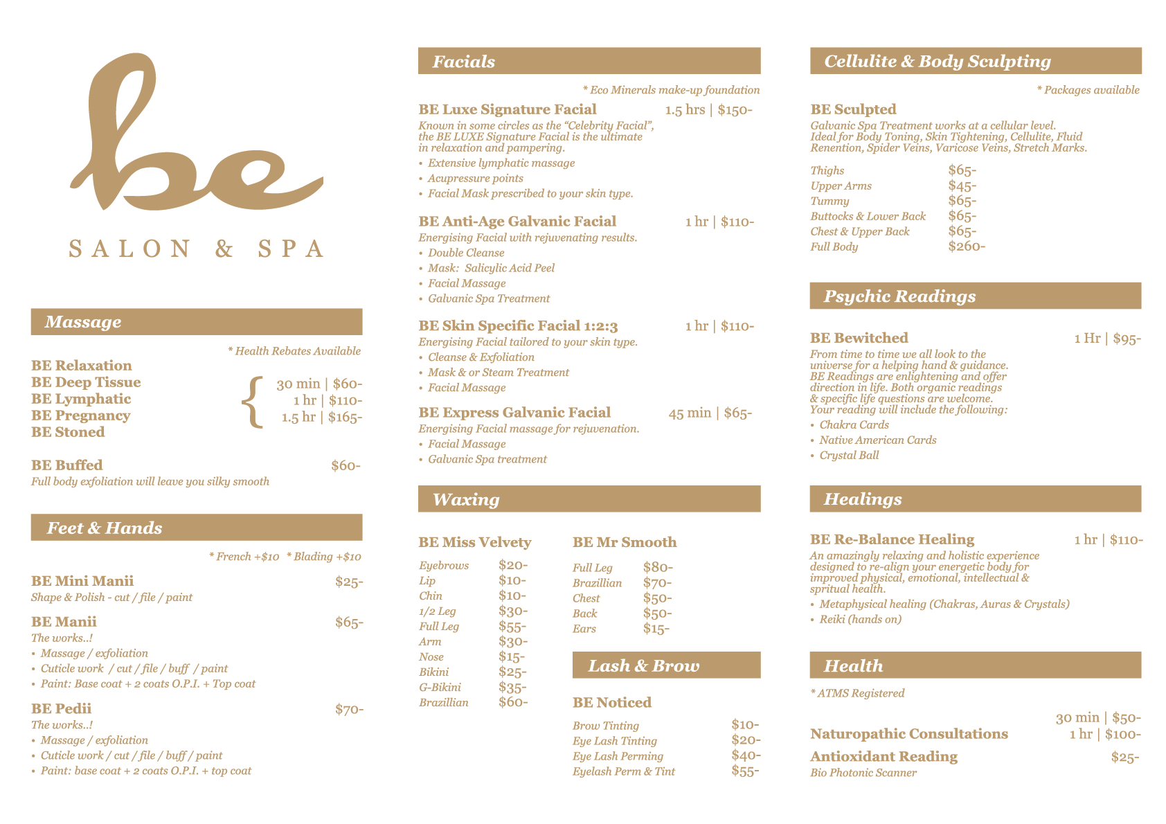
The final logo design offers simplicity and balance of both organic and structured design elements. The colours used for the branding were white & black with metallic gold and neutral accents. The stylised Bodhi Leaf has played a key role as the secondary / major design element in the branding. The shop front windows wrapped with a giant white leaf (applied in laser cut vinyl) act as a privacy screen for clients in the waiting room.
BE SALON & SPA BRANDING: LOGO DESIGN | BRAND DESIGN | SHOP SIGNAGE DESIGN | MARKETING COLLATERAL | PRINT ADVERTISING | WEB ADVERTISING | SOCIAL MEDIA | BROCHURE DESIGN | BUSINESS CARD DESIGN | GIFT VOUCHER DESIGN